So Poppy Datavore has been missing for a while. But she successfully reappeared today and promised to keep up with activities and tutorials as a New Year’s resolution. So to celebrate her return let’s talk about why we need data visualization.
If you need a refresher you can watch our video about What is Data and also ready about what is Data Visualization.
Why we need data visualizations?
Have you ever wondered how people turn big piles of information into something easy to understand? That’s what data visualization does! It helps us see patterns, make decisions, and tell stories using pictures instead of long lists of numbers. Let’s explore why data visualization is so useful—and even try a fun activity to make your own!
Imagine you have a notebook filled with pages of numbers about your school’s favorite lunches. It might take forever to figure out which lunch is the most popular, right? But if you make a colorful bar chart, you can see the answer in seconds! That’s the magic of data visualization—it makes tricky information quick and easy to understand. Here’s where we use it:
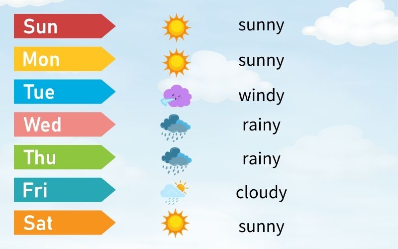
Weather Forecasts: When you see a weather app showing sunny, rainy, or snowy days on a chart, that’s data visualization! It helps us decide what to wear or whether to take an umbrella.
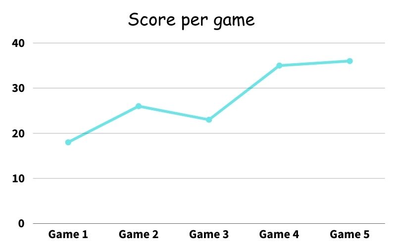
Sports Scores:
How do coaches figure out who played the best game? They use data like scores, goals, or points and make charts to compare.
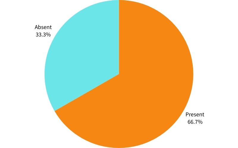
School Attendance:
Teachers keep track of who’s in class using charts. A pie chart can show how many days each student was present.
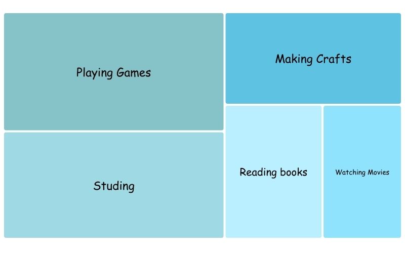
Fun at Home:
You can use data visualization for your own hobbies, too! For example, how many hours do you spend playing games, reading books, or watching cartoons? A graph can help you find out!
Activity: Make Your Own Data Visualization
Let’s create a chart about your day! Follow these steps:
- Write down everything you do in a day and how much time you spend on it. For example:
- Playing: 2 hours
- Homework: 1 hour
- Watching TV: 1.5 hours
- Grab some paper or use a computer tool like Google Sheets or Canva to create a bar chart or pie chart.
- Add colors to make it fun and easy to read.
Bonus Challenge: Try showing the same data in two different types of charts (like a bar chart and a pie chart). Which one do you think is easier to understand?
Data visualization is everywhere! It helps us understand the world, solve problems, and make decisions. So next time you see a chart or graph, remember—you’re looking at a picture of information. And who knows? Maybe you’ll be the next data viz wizard, making cool charts that help others learn and grow!
Share your chart with us! We’d love to see how you visualize your day. Ask a parent or teacher to help you send it to stela . y @ gmail.com.
