Bar charts are a great way to show data and compare different items. In this lesson, we will learn how to create a bar chart to show the most popular after-school activities among kids. Let’s get started!
Step 1: Gather the Data
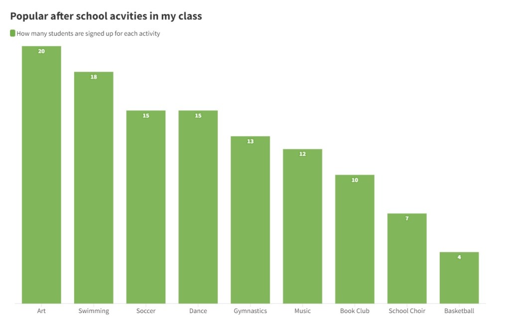
First, we need to gather the data we want to show in our bar chart. If you’d like you can go around your own school and ask your fellow students about what after school activities they do. We will use the following data:
| Activity | How many students are signed up for each activity |
| Art | 20 |
| Swimming | 18 |
| Soccer | 15 |
| Dance | 15 |
| Gymnastics | 13 |
| Music | 12 |
| Book Club | 10 |
| School Choir | 7 |
| Basketball | 4 |
Step 2: Create the Bar Chart
Now that we have our data, we can create the bar chart. A bar chart is made up of bars, with each bar representing a different item. The height of the bar shows how many kids chose that activity.
To create the bar chart, we can use any online tools that is available such as Google Sheets, Excel, etc. We can also draw the bar chart on a graph paper or a regular paper.
Here is what our bar chart looks like:
Step 3: Interpret the Bar Chart
Let’s look now at our chart and analyze which activity is the most popular. The tallest bar represents the activity in which most kids are signed up for. In this case, it is art with 20 kids.
Bar charts are a fun and easy way to show data. We can use them to compare different items and see which one is the most popular. You can practice creating your own bar charts using different data, like your favorite snacks or colors.
