In this very simple data viz excercise we will build a bar chart to visualize the weather during a year. How many days in a year are sunny, rainy, windy, cloudy or snowy.
Download the Google Sheet with the data.
Here is what our bar chart looks like:
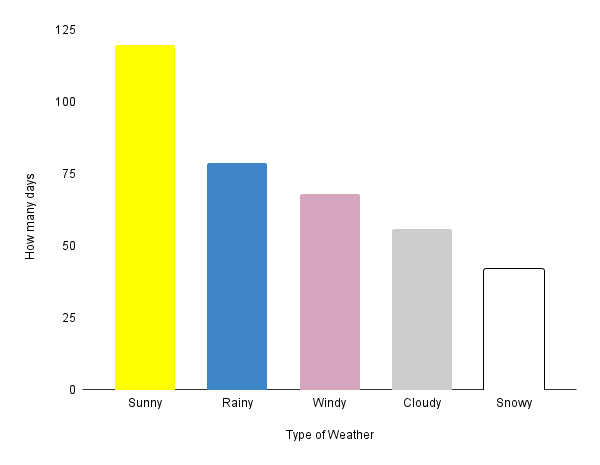
Notice how we use different colors on each bar – yellow for sunny, white for snowy, etc.
What is the weather like where you live? The weather is different in the different parts of the world. Use our table and chart template to build a bar graph that better represents the weather in your area.
