In one year the weather changes with the seasons. During fall and winter we expect colder temperatures while during spring and summer weather is expected to be warm even very hot on certain days.
In this exercise we will build a line chart. Line charts are good to show us changes over a certain period of time. For example during a week, during a month or during a year. Morover our line chart will be a double line chart because we will create a chart with two lines.
In this exercise we will see how temperatures change during the year. Our first line will show the change in maximum tempreatures and our second line will show the change over the year in minumum temperatures.
Maximum temperature means it is not going to get any hotter than certain degrees.
Minimum temperature means it is not going to get any colder than certain degress.
Keep in mind that in the different parts of the world the weather is different. For example it might be snowing and cold in New York City, but hot and sunny in Los Angeles. The temperatures in our data are average temperatures seen across more northern states and cities in USA.
Download our Google Sheet with the Data
This is how our line chart looks:
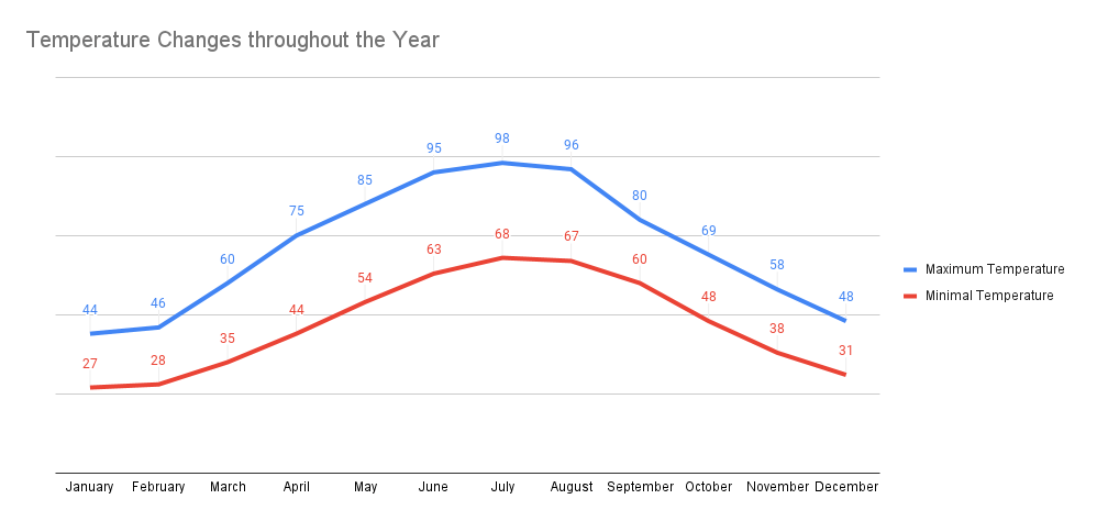
Notice how on this chart we have data labels on the lines and we do not have our vertical scale on the left.
This is how to create this chart in Google Sheets:
