In this excercise we will talk about the different languages spoken by people around the world.
Many countries have their own unique language. For example in Germany, people speak German.
There are languages that are spoken in more than one country. For example, English is spoke inthe USA, Canada, England and several other countries.
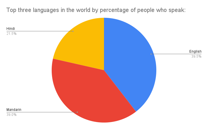
Based on the number of people speaking a specific language we are going to build a pie chart to show the most spoken languages in the world.
In our data table we have a list with the top ten languages spoken by most people in the world. Based on this data we will build a pie chart with the top three, top five or all top ten languages spoken across the world.
View our Google Sheet with the data
We can build pie charts in Excel or Google Sheets.
Things to know about pie charts:
- Pie chart look like pies or pizzas.
- Pie charts also are devided into sections that look like slices of pie or pizza.
- Each section represents our categories.
- The size of the slice depends on our category value.
Here is another pie chart to create with the most spoken languages in the US.
