With this data visualization excercise we will learn about each US state, look at a map of the USA and find out which states have the most number of people living in them.
Download the Google Sheet with the table.
If you are using a computer to work on this excercise you can find many tools that can build a map: Google Sheets, Flourish, Google Data Studio.
If you would like to make this a fun coloring activity, especially for a younger audience, download this US map and ask you students to color only the states with the biggest population. Or maybe use one color for the most populated states and another color for the least populated states.
Questions to ask:
What graph is this?
What is a population?
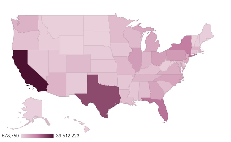
What are the top five most populated states?
What are the five least populated states?
